Brand
ing
|
|
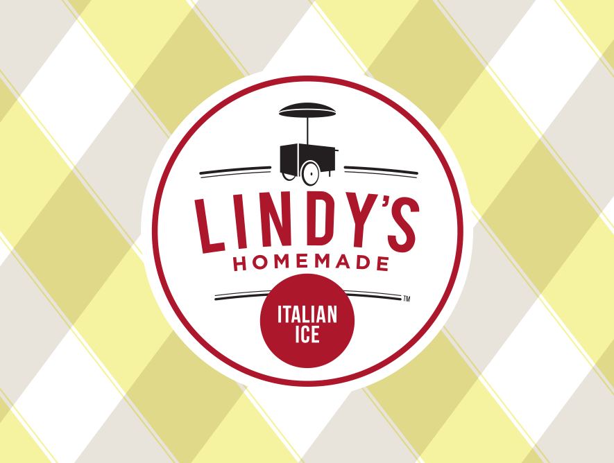
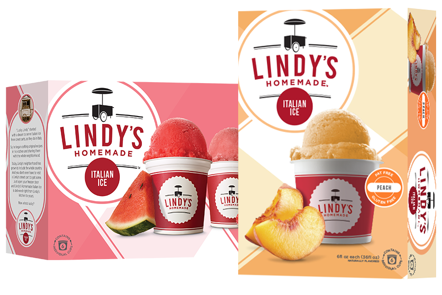
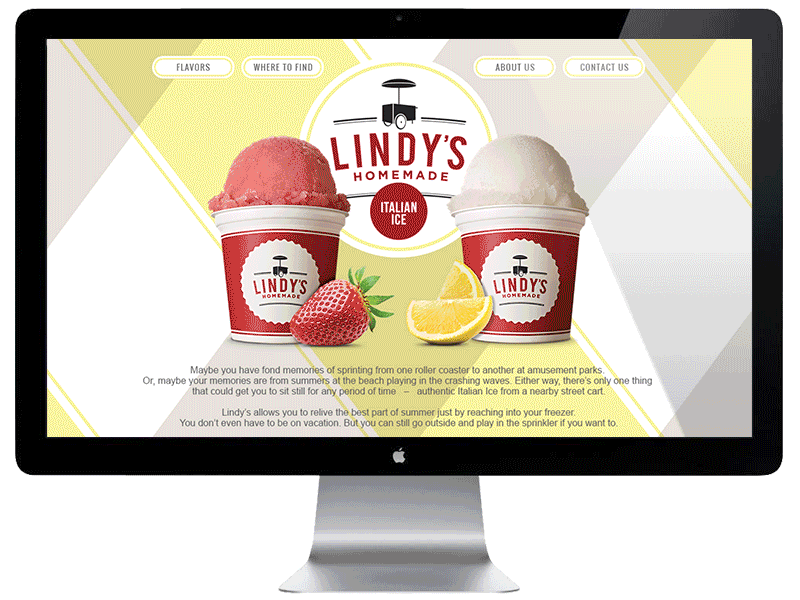
CHALLENGE: Lindy’s was being challenged by a larger brand who was using a discounting strategy. Retailers began forcing Lindy’s to also use discounting to move more product. This couponing war ultimately resulted in consumers buying only whatever was on sale. In other words, beyond price, they no longer had a reason to care about either brand.
SOLUTION: A renewed brand gave both the trade and consumers a reason to embrace Lindy’s over the competition. Using nostalgia as a springboard, we created a stronger connection to Lindy’s and that created a 400% increase in trade accounts and a 70% increase in retail sales. Looks like consumers have started caring again.
|
|
CHALLENGE: Lindy’s was being overshadowed by a larger brand using a discounting strategy. Retailers began forcing Lindy’s to also use coupons. This couponing war ultimately resulted in consumers to buy based only on whatever was on sale. In other words, beyond price, they no longer had a reason to care about either brand.
SOLUTION: A new brand gave both the trade and consumers a reason to embrace Lindy’s over the competition. Using nostalgia as a springboard, we created a stronger connection to Lindy’s and that created a 400% increase in trade accounts and a 70% increase in retail sales. Looks like consumers have started caring again.
CHALLENGE: Retailers were cutting SKU’s and dedicating a smaller set space for Lindy’s. Although this shifted with the new branding and the resurgence of consumer engagement, we still wanted to take better advantage of the space we were given.
SOLUTION: Historically, Lindy's was stocked horizontally to allow more SKU’s to be kept in the same space. The package was redesigned with the backside vertical so that one package could achieve two different set configurations. Two across, or three, grocer’s choice.
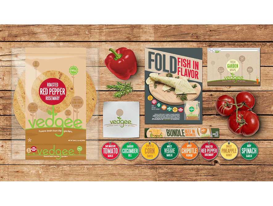
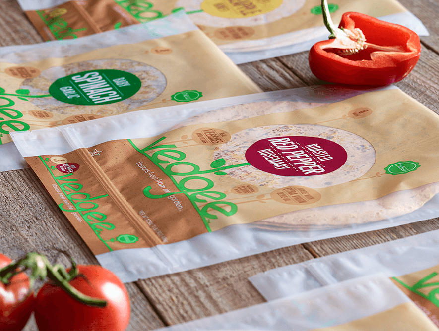
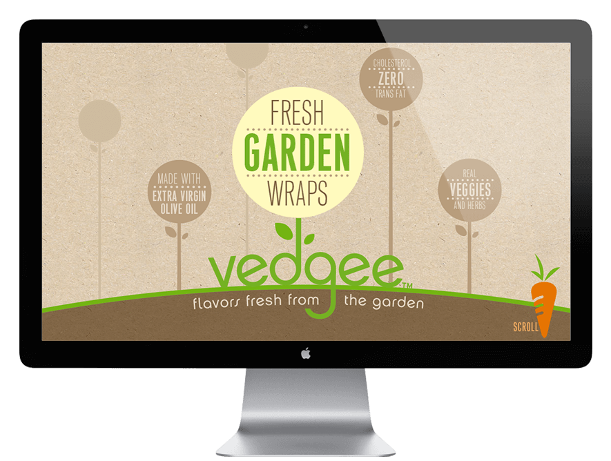
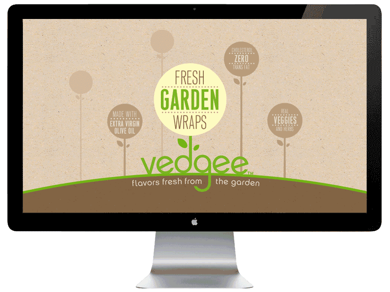
CHALLENGE: Easy Foods has a successful trade business making tortillas for high-end restaurants. Their hope was to expand into consumer retail stores. This market is over-saturated and has a couple of large, established brands already taking up the dedicated shelf space.
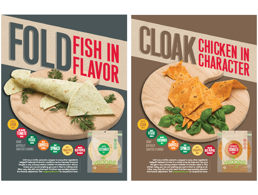
SOLUTION: This was more than just a branding exercise. This called for product innovation. How about a vegetable infused wrap? Create a healthier option with flavors in it to enhance the flavors you put on it. That uniqueness allowed us to create a brand that shows just what Vedgee is made of.
CHALLENGE: Being a new brand scrapping for shelf space, Vedgee needed to offer multiple display options to have the best chance of gaining entry to grocery stores. Ever looked at a tortilla shelf? Very crowded and very overwhelming. They need to stand out – or stand alone. The plan became to get them on shelf or on a stand in the produce section. Or both.
SOLUTION: Because you can see the vegetables and herbs embedded in the wrap, the solution was right there in plain sight. We created a focal point to quickly denote flavor and surrounded it with a window to show the ingredients. A stronger film created a bag that can lay flat or be hung and a matte finish creates a more natural feeling package.
COPY: Until now a tortilla was just a wrapper to carry other ingredients. Vedgee™ believes it’s time for a tortilla to be the inspiration that puts the gee in any culinary creation. Whether it’s battered cod or salmon tartare, you can put anything you want in them or nothing at all. Either way, they still carry the meal.
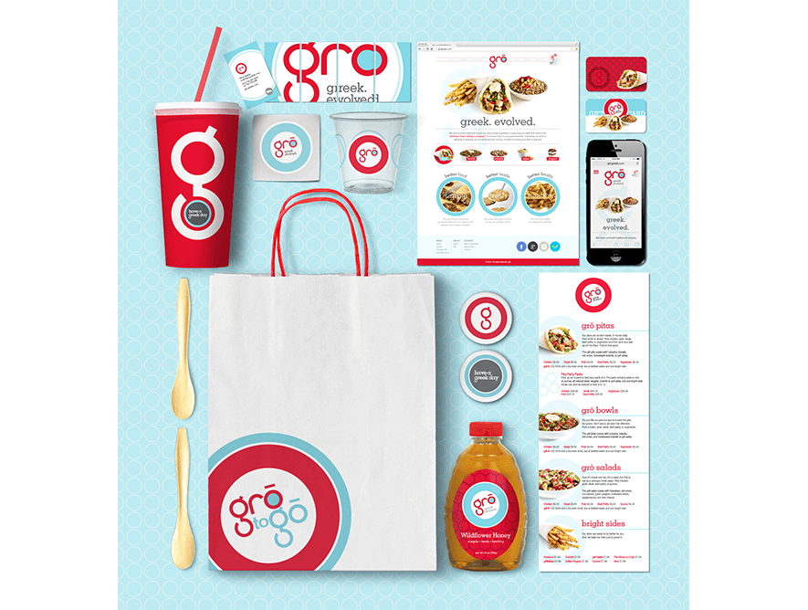
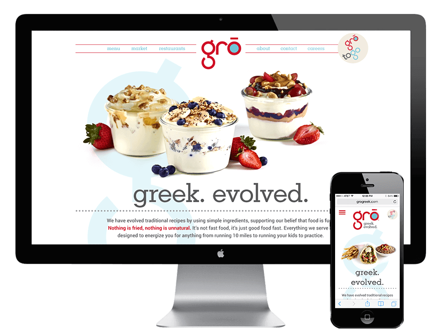
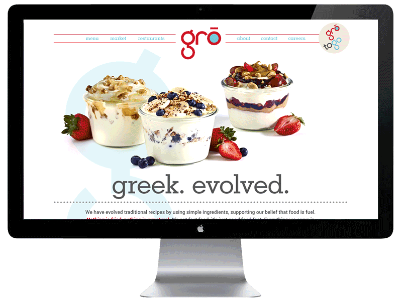
CHALLENGE: Name, brand and design everything to launch a fast-casual greek restaurant. The core values are to support a healthy community by serving simple, healthy, greek favorites more in-line with traditional preparation than what America has made greek into. This is not meat rotating on a vertical spit.
SOLUTION: The name itself is simple, suggesting food grown from the earth. The identity uses very symmetrical fonts and shapes to uphold simplicity and give it the same feeling of balance that the food provides. The bright colors and use of blue and white even says “have a greek day”.
gro was founded by four life-long friends. Each brought a very specific talent to the restaurant. When it was time to create business cards, we wanted to celebrate that each of them can stand alone but together they make gro. When each card was put side-by-side, they formed the gro logo.
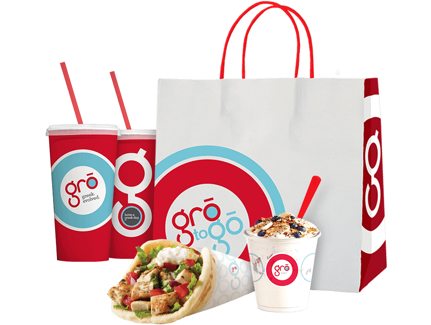
CHALLENGE: Create multiple packaging units, make them all work together without just pasting the logo on each of them in an uninspired way. Each piece should feel like another handshake from a cheerful friend. Or even a hug if you don't have personal space issues.
SOLUTION: Building from the simplicity of the identity, a design “toolkit” was created. We designed patterns and used the bright colors to build an undeniably recognizable brand. The cup was designed to be a billboard of sorts when people took it back to work.
Print
|
|
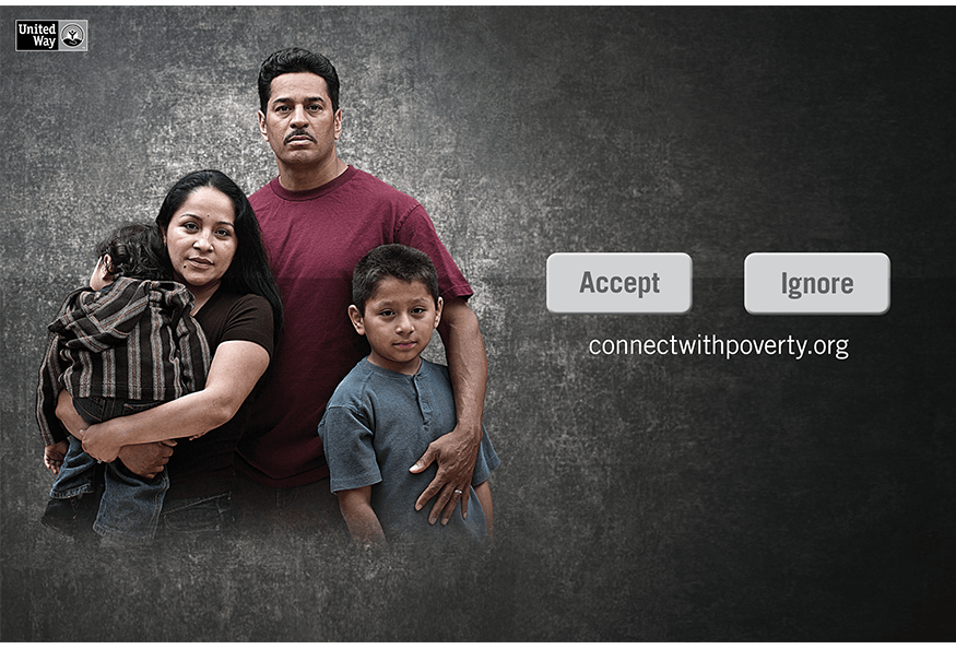
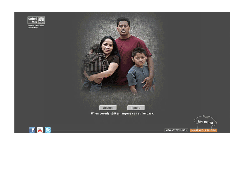
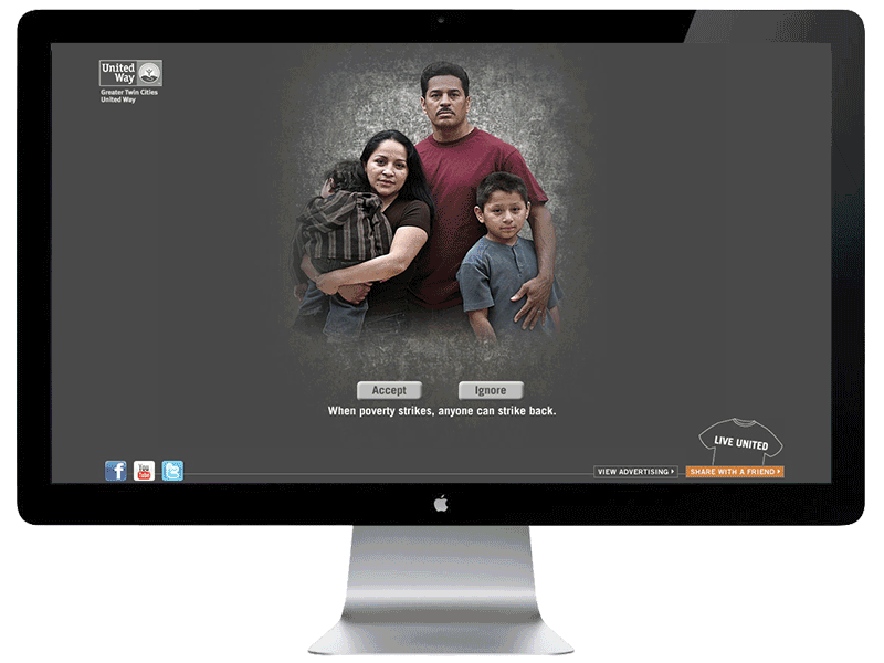
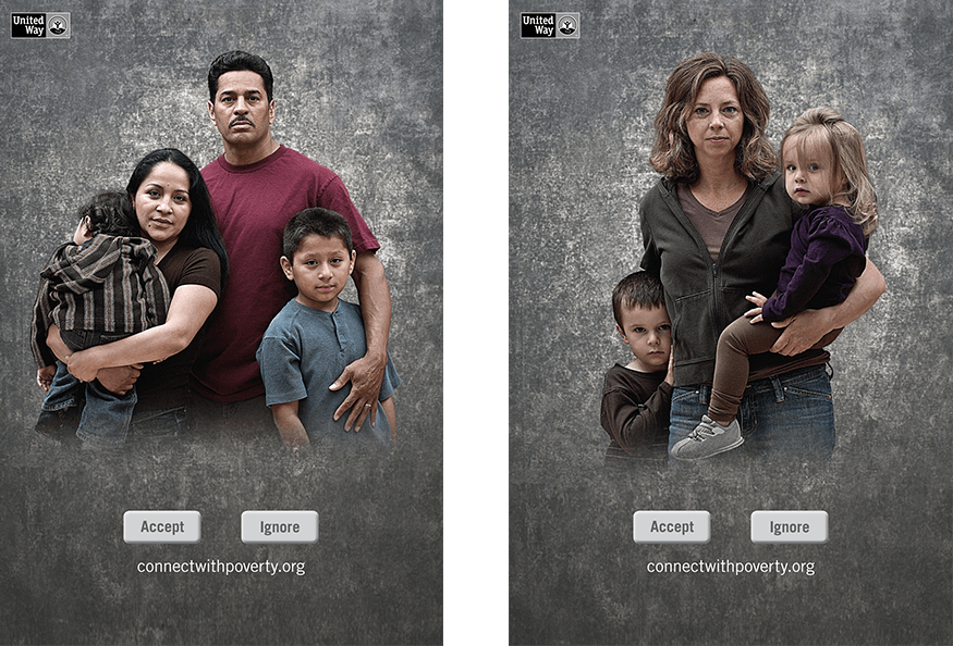
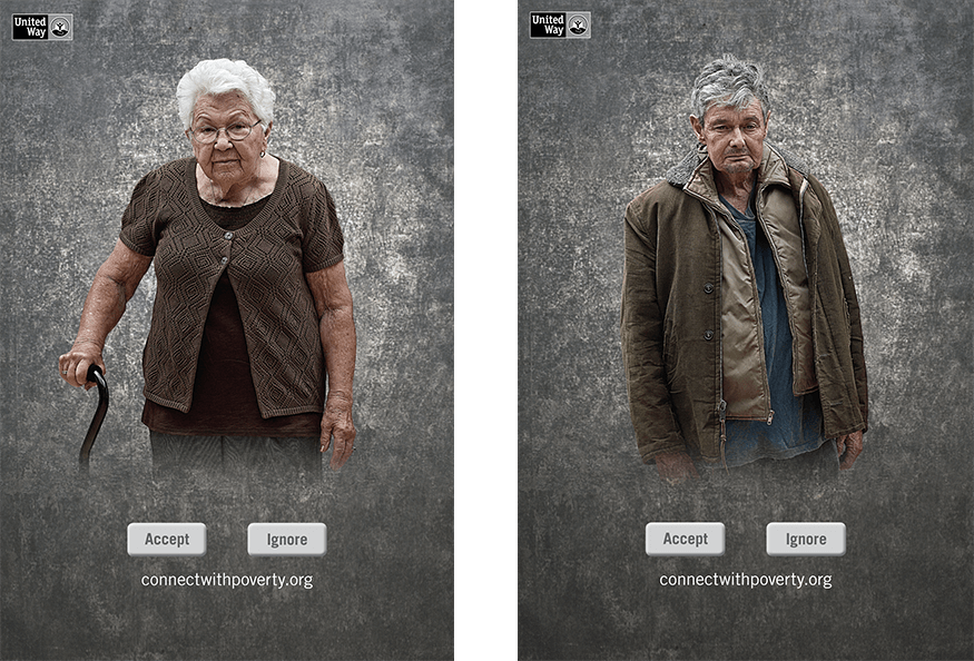
CHALLENGE: Every year United Way has a guest CEO, and every year they try to up the ante. That is to be expected. However, the issue for this particular year was the economy. It was waaaay down. That generally means donations would also be way down. Or would they?
SOLUTION: In the past, United Way focused marketing on one charitable cause. Usually homelessness. In the current climate, it made sense to relate to people of all classes. Afterall, everyone knew someone unemployed and in need of help. We convinced UWay to expand the message and, in turn, we matched the previous years donation levels.
|
|
CHALLENGE: Every year United Way has a guest CEO, and every year they try to up the ante. That is to be expected. However, the issue for this particular year was the economy. It was waaaay down. That generally means donations would also be way down. Or would they?
SOLUTION: In the past, United Way focused marketing on one charitable cause. Usually homelessness. In the current climate, it made sense to relate to people of all classes. Afterall, everyone knew someone unemployed and in need of help. We convinced UWay to expand the message and, in turn, we matched the previous years donation levels.
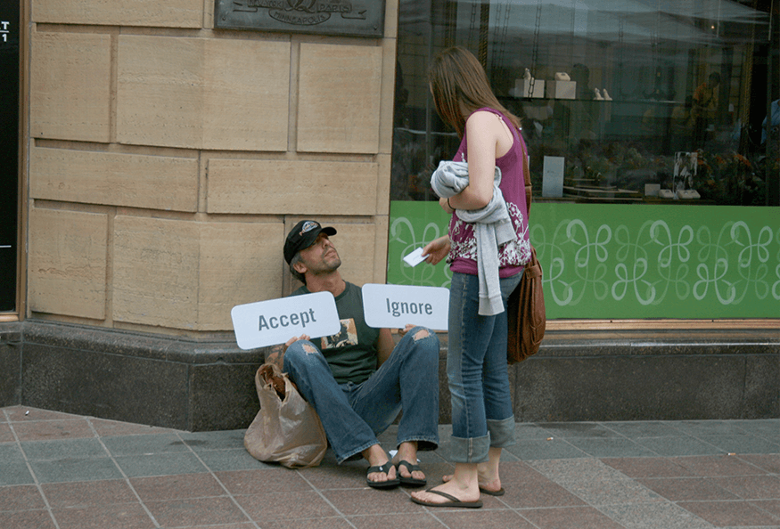
We built upon the print campaign by utilizing a guerilla tactic and posing as homeless people all around the city. When a concerned citizen approached, we presented them with another option to help. A card that drove them to the website to learn about our message that a much broader spectrum of people need help.
91-94


asst art director
harris drury cohen
ft lauderdale, fl
95-97


art director
long haymes carr
winston salem, nc
98-99


senior art director
long haymes carr
winston salem, nc
00-07

senior art director
campbell mithum
minneapolis, mn
08-10


associate creative director
campbell mithum
minneapolis, mn
11-14


creative director
concentric
charlotte, nc
15-16


creative director
red7 test
charleston, sc
© gary carter